H
handyplayer13
Hallo,
hab mir gerade ein neues Design für meine Website gesucht und auch gefunden.
Ich will das aber ein bisschen anders als es vorgegeben ist, nur leider kenn ich mich damit überhaupt nicht aus.
Könnte mir das bitte jemand ändern
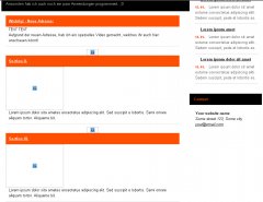
Hier ein Bild wie es aussieht: http://www.handyplayer13.tk/Bilder/vorher.PNG
Hier ein Bild so ähnlich wie es aussehen soll (hab ich mit Paint.NET gemacht): http://www.handyplayer13.tk/Bilder/nachher.PNG
-----------------------------------------------------------------------
Hier die Datei main.css:
Hier der Quellcode:
hab mir gerade ein neues Design für meine Website gesucht und auch gefunden.
Ich will das aber ein bisschen anders als es vorgegeben ist, nur leider kenn ich mich damit überhaupt nicht aus.
Könnte mir das bitte jemand ändern
Hier ein Bild wie es aussieht: http://www.handyplayer13.tk/Bilder/vorher.PNG
Hier ein Bild so ähnlich wie es aussehen soll (hab ich mit Paint.NET gemacht): http://www.handyplayer13.tk/Bilder/nachher.PNG
-----------------------------------------------------------------------
Hier die Datei main.css:
CSS:
/*Structure:
display; position; float; z-index; overflow; width; height; margin; padding; border; background; align; font;

Content:

1) HTML tags, reset
2) Universal styles (display, float, margin, text-align...)
3) Generally HTML styles (table, ul, dl...)
4) Layout
5) Page: Home*/

/*1) HTML tags, reset */

* {margin:0; padding:0;}
body, div, span, p, a, img, ul, ol, li, caption, table, thead, tbody, tfoot, tr, th, td, form, fieldset, legend, label, dl, dt, dd, blockquote, applet, object, h1, h2, h3, h4, h5 {border:0;}
body {padding-bottom:20px; background:url("../design/bg.gif") 0 0 repeat-x; font:0.8em/1.5 "arial",sans-serif; text-align:center;}

h1, h2, h3, h4, h5, h6 {margin:15px 0 10px 0;}
h1 {font-size:180%;}
h2 {font-size:160%;}
h3 {font-size:140%;}
h4 {font-size:120%;}
h5 {font-size:100%;}

p, table, ul, ol, dl, fieldset {margin:15px 0;}

table {border-collapse:collapse; border-spacing:0; font-size:100%;}
th {text-align:center; font-weight:bold;}
th, td {padding:3px 7px;}

ul, ol {margin-left:30px;}
ul ul, ol ol {margin:0; margin-left:20px;}
ol {list-style-type:decimal;}
li {display:list-item;}

dt {font-weight:bold;}
dd {margin-left:30px;}

fieldset {position:relative; padding:10px;}
legend {position:absolute; top:-1em; margin:0; padding:5px 10px; font-size:100%; font-weight:bold;}

/* 2) Universal styles (display, float, margin, text-align...) */

.box {min-height:1px;}
.box:after {display:block; visibility:hidden; clear:both; line-height:0; font-size:0; content:".";}

.relative {position:relative;}

.clear {clear:both;}

.f-left {float:left !important;} img.f-left {float:left; margin-right:10px;}
.f-right {float:right !important;} img.f-right {float:right; margin-left:10px;}

.t-left {text-align:left !important;}
.t-center {text-align:center !important;}
.t-right {text-align:right !important;}
.t-justify {text-align:justify !important;}

.va-top {vertical-align:top;}
.va-middle {vertical-align:middle;}
.va-bottom {vertical-align:bottom;}

.nom {margin:0 !important;}
.nomt {margin-top:0 !important;}
.nomb {margin-bottom:0 !important;}

.noscreen {display:none;}

/* 3) Generally HTML styles (table, ul, dl...) */

table.table-style01 {width:100%;}
table.table-style01 th {text-align:center;}

ul.ul-style01 {margin:15px 0 15px 20px; padding:0; list-style:none;}
ul.ul-style01 li {margin:0; padding:0; padding-left:15px; background:url("../design/ul-style01.gif") 0 5px no-repeat;}
ul.ul-style01 ul {margin:0; padding:0; list-style:none;}
ul.ul-style01 ul li {background:url("../design/ul-style01-sub.gif") 0 5px no-repeat;}

/* 4) Layout */

#main {width:910px; margin:0 auto; text-align:left;}

#header {position:relative; height:100px; background:url("../design/header.jpg") 0 0 no-repeat; overflow:hidden;}

#logo {position:absolute; top:30px; left:80px; margin:0; font-size:200%; letter-spacing:-1px; font-weight:normal;}
#logo span {font-weight:bold;}
#logo a {text-decoration:none;}

#slogan {position:absolute; top:40px; right:15px; width:230px; font-size:120%; font-weight:normal; font-style:italic; text-align:center;}

#nav {padding:0 15px 5px 6px; background:url("../design/nav.gif") 0 100% no-repeat;}

#nav ul {margin:0; padding:0; list-style:none;}
#nav ul li {display:inline; margin:0; padding:0;}
#nav ul li a {display:block; float:left; padding:12px 15px 12px 14px; background:url("../design/nav-link.gif") 100% 0 repeat-y; text-decoration:underline;}
#nav ul li#nav-active a {font-weight:bold; text-decoration:none;}

#cols {background:url("../design/cols.gif") 0 0 repeat-y;}

#content {float:left; width:655px; overflow:hidden;}

#content #content-title {margin:0; padding:15px 15px 10px 20px; background:url("../design/content-title.gif") 0 0 no-repeat; font-size:140%; font-weight:normal;}
#content #content-in {padding:15px 15px 10px 20px;}

#aside {float:right; width:255px; overflow:hidden;}

#aside #aside-title {margin:0; padding:15px 15px 10px 15px; background:url("../design/aside-title.gif") 0 0 no-repeat; font-size:140%; font-weight:normal;}
#aside .aside-in {padding:10px 10px 15px 10px;}
#aside .aside-box {padding:10px; background:url("../design/aside-box.jpg") 0 0 no-repeat;}
#aside .title {margin:0 5px 0 0; padding:10px 15px; background:url("../design/aside-title-02.gif") 0 0 repeat-x; font-size:100%;}

#cols-bottom {width:910px; height:12px; background:url("../design/cols-bottom.gif") 0 0 no-repeat; font-size:0;}

#footer {width:870px; height:40px; padding:20px 20px 0 20px; background:url("../design/footer.gif") 0 0 no-repeat;}
#footer p {margin:0;}

/*5) Page: Home*/

#perex {margin-left:5px; padding:15px; background:url("../design/perex.gif") 0 100% no-repeat;}
#perex p {margin:0;}

#sections {background:url("../design/sections.gif") 0 0 repeat-y;}
#sections-bottom {width:620px; height:7px; background:url("../design/sections-bottom.gif") 0 0 no-repeat; font-size:0;}

.section {float:left; width:200px;}
.section p {margin:0;}
.section.margin {margin:0 10px;}
.section h3 {margin:0; padding:10px; background:url("../design/section-title.gif") 0 0 no-repeat; font-size:100%;}
.section-in {margin-bottom:10px; padding:0 10px 10px 10px;}

dl#news, dl#news dd {margin:0;}
dl#news dt {clear:both; padding-left:18px; background:url("../design/ico-list.gif") 0 2px no-repeat;}
dl#news dd {margin:7px 0 10px 0; padding-bottom:10px;}
dl#news dd span.date {padding-right:10px; background:url("../design/date.gif") 100% 50% no-repeat; font-size:85%; font-weight:bold;}

---------------------------------------------------------------------------------------------------------

Hier scheme.css:
/* HTML*/

body {background-color:#bfbfbf;}

a {color:#000;}
a:hover {color:#FF4F00;}

/* Generally HTML styles (table, ul, dl...)*/

table.table-style01 {border:1px solid #CCC;}
table.table-style01 th {border-right:1px solid #CCC; background:#EFEFEF; color:#FF2F00;}
table.table-style01 td {border:1px solid #DDD;}
table.table-style01 tr.bg td {background:#F5F5F5;}

/*Layout */

#header {background-color:#000;}

#logo span {color:#FF4F00;}
#logo a {color:#FFF;}

#slogan {color:#AFAFAF;}

#nav {background-color:#D9D9D9;}
#nav ul li a {color:#555;}
#nav ul li#nav-active a {color:#000;}
#nav ul li a:hover {color:#000;}

#cols {background-color:#FFF;}

#content #content-title {background-color:#000; color:#FF4F00;}

#aside #aside-title {background-color:#000; color:#FFF;}
#aside .title {background-color:#000; color:#FF4F00;}

#footer {background-color:#000; color:#999;}
#footer a {color:#999;}
#footer a:hover {color:#FFF;}

/* Page: Home */

#perex {border-top:1px solid #2A2A2A; background-color:#000; color:#CCC;}
#perex a {color:#CCC;}
#perex a:hover {color:#FF4F00;}

.section h3 {background-color:#FF4F00; color:#FFF;}
.section h3 a {color:#FFF;}
.section h3 a:hover {color:#000;}
.section-in {border-bottom:1px solid #DADADA;}

dl#news dd {border-bottom:1px solid #CACACA; color:#555;}
dl#news dd span.date {color:#FF2F00;}
Hier der Quellcode:
HTML:
<?xml version="1.0"?>
<!DOCTYPE html PUBLIC "-//W3C//DTD XHTML 1.0 Transitional//EN"
"http://www.w3.org/TR/xhtml1/DTD/xhtml1-transitional.dtd">
<html xmlns="http://www.w3.org/1999/xhtml">
<head>
<meta name="author" content="Sebastian Hofer" />
<link rel="shortcut icon" href="http://www.handyplayer13.tk/Bilder/favicon.ico" type="image/x-icon" />
<title>Sebastians Homepage! </title>
<meta http-equiv="content-type" content="text/html; charset=ISO-8859-1" />
<link rel="stylesheet" media="screen,projection" type="text/css" href="css/main.css" />
<!--[if lte IE 6]><link rel="stylesheet" type="text/css" href="css/main-msie.css" /><![endif]-->
<link rel="stylesheet" media="screen,projection" type="text/css" href="css/scheme.css" />
<link rel="stylesheet" media="print" type="text/css" href="css/print.css" />
</head>
<body>
<div id="main">
<div id="header">
<h1 id="logo"><a href="http://www.handyplayer13.tk"><span>Sebastians</span> Website!</a></h1>
<hr class="noscreen" />
<div id="slogan">Hier ist für jeden was dabei.</div>
<hr class="noscreen" />
<p class="noscreen noprint"><em>Quick links: <a href="#content">content</a>, <a href="#nav">navigation</a>.</em></p>
<hr class="noscreen" />
</div>
<div id="nav">
<ul class="box">
<li id="nav-active"><a href="http://www.handyplayer13.tk/Dokumente/index2.html">Startseite</a></li>
<li><a href="">Meine Programme</a></li>
<li><a href="">Ergebnisse der WM</a></li>
<li><a href="">Visitenkarte</a></li>
<li><a href="">Nintendo 3DS</a></li>
<li><a href="">Banner</a></li>
<li><a href="">Umfragen</a></li>
<li><a href="">Wetter</a></li>
<li><a href="">Scherzfrage des Tages</a></li>
<li><a href="">Lieder</a></li>
<li><a href="">Spiele</a></li>
<li><a href="">Flash Board</a></li>
<li><a href="">Videos</a></li>
<li><a href="">Chat</a></li>
<li><a href="">Shoutbox</a></li>
<li><a href="">Gästebuch</a></li>
<li><a href="">Kontakt</a></li>
</ul>
<hr class="noscreen" />
</div>
<div id="cols" class="box">
<div id="content">
<h2 id="content-title">Herzlich Willkommen auf meiner Website!!</h2>
<div id="perex" class="box">
<p>Einen Teil von dieser Website habe ich selber mit "HTML" erstellt.<br />Ansonsten hab ich auch noch ein paar Anwendungen programmiert. ;D</p>
</div>
<hr class="noscreen" />
<div id="content-in">
<div id="sections" class="box">
<div class="section">
<h3><a href="http://www.free-css.com/">Wichtig! - Neue Adresse:</a></h3>
<div class="section-in">
<p>TEXT TEXT<br />
Aufgrund der neuen Adresse, hab ich ein spezielles Video gemacht, welches ihr euch hier anschauen könnt!</p>
</div>
<p class="t-center"><a href="/"><img src="design/btn-more.gif" width="40" height="22" alt="" /></a></p>
</div>
<div class="section margin">
<h3><a href="http://www.free-css.com/">Section II.</a></h3>
<p><a href="http://www.free-css.com/"><img src="tmp/image.gif" width="200" height="150" alt="" /></a></p>
<div class="section-in">
<p>Lorem ipsum dolor sita ametes ensectetue adipiscing elit. Sed suscipit e lobortis. Semi ornare aliquam tortor. Aliquame bit.</p>
</div>
<p class="t-center"><a href="http://www.free-css.com/"><img src="design/btn-more.gif" width="40" height="22" alt="" /></a></p>
</div>
<div class="section fix">
<h3><a href="http://www.free-css.com/">Section III.</a></h3>
<p><a href="http://www.free-css.com/"><img src="tmp/image.gif" width="200" height="150" alt="" /></a></p>
<div class="section-in">
<p>Lorem ipsum dolor sita ametes ensectetue adipiscing elit. Sed suscipit e lobortis. Semi ornare aliquam tortor. Aliquame bit.</p>
</div>
<p class="t-center"><a href="http://www.free-css.com/"><img src="design/btn-more.gif" width="40" height="22" alt="" /></a></p>
</div>
</div></div>
</div>
<hr class="noscreen" />
<div id="aside">
<h4 id="aside-title">News</h4>
<div class="aside-in">
<div class="aside-box">
<dl id="news">
<dt><a href="http://www.free-css.com/">Lorem ipsum dolor sit amet</a></dt>
<dd><span class="date">15. 01.</span> Lorem ipsum dolor sit amet estame consectetue adipiscing eliti. Sedem suscipit, pede et lobortis es.</dd>
<dt><a href="http://www.free-css.com/">Lorem ipsum amet</a></dt>
<dd><span class="date">15. 01.</span> Lorem ipsum dolor sit amet estame consectetue adipiscing eliti. Sedem suscipit, pede et lobortis es.</dd>
<dt><a href="http://www.free-css.com/">Lorem ipsum dolor sit amet</a></dt>
<dd><span class="date">15. 01.</span> Lorem ipsum dolor sit amet estame consectetue adipiscing eliti. Sedem suscipit, pede et lobortis es.</dd>
</dl>
</div>
</div>
<h4 class="title">Contact</h4>
<div class="aside-in">
<div class="aside-box">
<address>
<strong>Your website name</strong><br />
Some street 123, Some city<br />
<a href="http://www.free-css.com/">your@email.com</a>
</address>
</div>
</div>
</div>
</div>
<div id="cols-bottom"></div>
<hr class="noscreen" />
<div id="footer">
<p>© Copyright 2010 by Sebastian Hofer - <a href="http://www.handyplayer13.tk">www.handyplayer13.tk</a></p>
</div>
</div>
</body>
</html>
Zuletzt bearbeitet von einem Moderator:
")